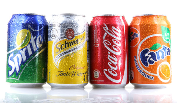
There is a common exercise conducted by teachers in marketing schools to prove a point to students.
Projected onto the screen, the teacher will display each letter of the alphabet. Instead of reciting the letters though, the students are asked to recite the brand of the letter’s typeface. Like clockwork, from A-Z, the brand names roll off the tongues of students.
The exercise is an unnerving example of just how powerful and engrained visual branding can be in a person’s psyche.
While achieving the instant brand-recognition associated with Coca-Cola for example would be unlikely, a strong visual brand can help businesses connect with their target markets, drive engagement and ultimately achieve growth.
The best visual representations accurately and concisely reflect the overall brand message. But getting it right is no easy task. You must create a visual brand image that is simple, easily recognisable, unique, and easy to relate to.
Dan Ratner, MD of uberbrand, affirms that creating a successful visual brand identity is not as simple as designing an attractive logo.
“Everything needs to link back to and support both the business and the brand’s intention. While there is no magic formula for getting a brand’s visual identity right, there are elements that successful brands consistently use. People say ‘never judge a book by its cover’, but in branding, the cover certainly contributes.”
When developing a brand’s visual identity, Ratner believes in six key ingredients:
1. Understanding the audience
One of the greatest challenges of visual branding is creating something that evokes the right feelings about your brand in your audience. Your brand is their perception; ultimately the sum of every impression your customers receive from you. What evokes a positive reaction with one group might have the opposite reaction in another, so an accurate representation and understanding of your audience is vital for brands when developing a new logo or visual identity. Understanding your customers is the most fundamental step in building your brand’s visual identity, but it’s often overlooked.
2. A singular message
While evoking that “right feeling” through your visual identity is vital, it is important not to represent too many messages at once or you risk diluting the image. Ask yourself what is the single most important idea you want your customer to ‘get’ when they look at you, then design a visual identity that truly represents that idea. This helps to provide a targeted design objective and makes briefing your designer much easier.
3. Clear brand attributes and benefits
If you are designing a visual for a product then think about the specific benefits it provides. It is important to differentiate between features and benefits. Features are product specifications, while benefits are about fulfilling needs. For example, the features of slimming underwear would be the superior materials and colour. The benefits would be a slimmer silhouette and feeling more confident and sexy. Reflecting these benefits in your product creates an association between the benefits and the brand in the minds of your customers.
4. Symbols
For some brands, symbols can be a simple but clever way to create shortcuts that evoke feelings or represent a brand’s attributes. For example, the deceptively-simple Amazon logo has an arrow pointing from the A to the Z, creating a subtle representation that they have everything you could need. The arrow also forms a smiley face, suggesting customers will be happy they chose Amazon.
There are lots of hidden symbols in some of the world’s most iconic brands.
The Guild of Food Writers subtly inserts a spoon in the negative space created by its pen logo, perfectly summing up what it does. Yoga Australia uses the negative space created by a yoga posing woman to create a map of Australia, while Toblerone has a bear symbol in the mountain representing the city of Berne in Switzerland where Toblerone is produced.
5. Characters
For some, having a brand mascot can be a great way to bring a brand to life – giving it personality and lifting it up from obscurity. This can work well for brands that otherwise might seem dry. Starbucks famously uses a twin-tailed mermaid in their logo to represent the strong seaport roots of the Seattle company and to provide an alluring mystery around the brand.
Android software is represented by a friendly-looking robot, suggesting its ease of use and fun apps. Lacoste uses a mascot in their logo effectively. They, as well as other fashion brands, choose to subtly change their image every year, ensuring that while the core brand visual remains easily recognisable customers still want to come back and buy the latest range.
Characters can be effective but it is important to choose or create a character that is suitable for your audience. For example, childish characters are unlikely to work with some adult audiences.
6. The right typefaces and colours
Different colours and fonts elicit different responses. So again, they should reflect the message you are trying to convey. For example a children’s brand might use softer, rounder fonts while a brand looking to convey strength might use sharper lines.
Uppercase typefaces can look like they’re yelling, lowercase seems more accessible. Serifs (eg. the little flicks on Times New Roman) can give the impression of maturity, where Sans serifs (e.g. Arial) can appear more contemporary.
Similarly, colours can also elicit certain feelings towards a brand. Yellow may be perceived as cheery and blue as clean and calm, while orange can be seen as energetic. Many colours are strongly linked to the brand they represent, such as ‘Cadbury purple’ or ‘Coca-Cola red’.

