

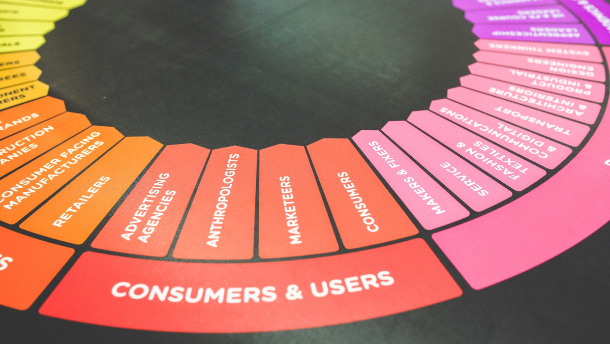


Humans are colour hungry. With thirty percent of our brains dedicated to visual processing, we respond to colour much faster than text.
In a world where almost half of Australian workers report feeling burnt out, Nathan Rawlins is looking beyond wellness programs and flexible hours for solutions.
The CMO of Lucid Software believes the answer might be hiding in plain sight: the colours we see every day in our digital workspaces.
With burnout rates climbing 17% in just one year according to The Australian Institute of Health and Safety, traditional approaches are clearly falling short. While most companies focus on obvious fixes like mental health webinars and work from home policies, Rawlins is exploring something far more subtle yet potentially transformative.
“It’s clear that Australian workplaces are facing a burnout problem. Almost half of the Australian workforce (43%) is reporting feeling burnt out, up a staggering 17% in just the past year,” Rawlins observes. “This isn’t just about individual well-being; it has a real, tangible effect on workplace productivity, creativity, and overall engagement.”
His solution challenges conventional thinking about workplace wellness by focusing on an element most leaders never consider: the psychological impact of colour in digital environments.
Beyond surface level solutions
Rawlins argues that addressing burnout requires a more comprehensive approach than most organizations are taking. The problem runs deeper than workload management or mental health resources.
“There is no single solution to burnout. Wellbeing webinars and flexible hours have their place, but on their own, they fall short. Tackling burnout effectively means exploring a broad range of influences including some of the more subtle psychological factors that impact cognitive load, emotional tone, and collaboration dynamics. One such factor? Colour.”
It’s an unconventional perspective that reflects a growing understanding of how environmental factors influence workplace wellbeing. In increasingly digital work environments, the visual elements we interact with hundreds of times per day may have more impact than previously recognized.
“In today’s digital first workplaces, colour is everywhere you look, embedded into dashboards, calendars, chat highlights, and feedback comments. But while we’re surrounded by colour, few businesses are thinking about how to use it strategically. When thoughtfully applied, colour can support clarity, reduce cognitive load, and contribute to a more emotionally balanced and collaborative workplace.”
The cost of visual monotony
Rawlins has identified what he calls “beige office culture” as a significant but overlooked contributor to workplace disengagement. This phenomenon extends far beyond physical office design into the digital realm where most modern work actually happens.
“Have you ever found yourself mentally checking out during a virtual brainstorming session, or felt a sharp sting from blunt digital feedback? Often, the root cause is something you barely notice: colour, or the lack of it.”
The problem, according to Rawlins, lies in the default colour choices that dominate business software and digital collaboration tools.
“The modern workplace is awash in neutrals: grey spreadsheets, white interfaces, beige platforms, and that jarring red text for edits. While these choices might appear harmless, they create a ‘beige office culture’, one where visual monotony stifles engagement and harsh accents like red trigger stress or defensiveness.”
This insight is backed by research from colour expert Jill Morton, whose work Rawlins frequently references. Morton’s findings suggest that humans are fundamentally wired to respond to colour in ways that directly impact their cognitive performance and emotional state.
“Humans are fundamentally ‘colour hungry’, as Jill Morton, CEO of Colorcom and director of the International Color Research Institute, describes. With over 30% of our brains dedicated to visual processing, we’re hardwired to respond to colour much faster than we do to text. Colour cues directly shape how we absorb information, interpret emotion, and interact with others.”
The science behind colour response
The psychological impact of colour isn’t just aesthetic preference. Rawlins explains that our responses are rooted in both evolutionary psychology and learned associations that create predictable patterns in how we process information.
“Morton explains that our reactions to colour stem from both our primal brain wiring and our learned experiences. That’s why a harsh red edit can feel more severe than a constructive green comment, even when the message is identical. Despite this powerful influence, many organisations default to colour schemes that overwhelm rather than clarify. In doing so, they unintentionally reinforce ‘beige office culture’.”
The consequences of ignoring these psychological realities extend beyond individual comfort to measurable impacts on team performance and collaboration.
“The result? A digital workplace where teams disengage, misread cues, and miss opportunities to collaborate effectively.”
However, Rawlins sees this as an opportunity rather than just a problem. Organizations that understand these dynamics can leverage them for competitive advantage.
“Businesses that understand and harness these associations can radically improve their teams’ productivity and collaboration. To enhance the employee experience, leaders must reject the beige default and begin treating colour as a tool, especially in virtual environments where tone can be difficult to convey.”
Measurable impact on performance
The benefits of strategic colour use extend far beyond making digital interfaces more visually appealing. Rawlins cites research showing significant improvements in cognitive performance and information processing.
“Morton’s research underscores a powerful truth: strategic colour use can boost comprehension by an impressive 73% and increase readership by 40%. This isn’t just about making things look pretty; it is a significant win for productivity.”
These improvements become particularly valuable in high pressure work environments where information overload is common.
“In high pressure digital environments, where teams are often overloaded with data and deadlines, colour can help cut through the noise. It brings structure, reduces ambiguity, and makes information instantly more digestible.”
Rawlins provides practical examples of how these principles can be applied in everyday workplace scenarios.
“For example, in feedback scenarios, leaders can avoid defensive reactions by replacing red strike throughs with softer hues like green, which communicates growth and progress. This creates a more open and constructive tone, a small shift that makes it easier for people to process and act.”
The concept extends to information architecture and visual design principles that can reduce cognitive burden on workers.
“Another powerful concept is ‘visual elbow room’, the use of white space and simplified colour palettes to reduce mental clutter. Too many competing colours or crowded designs can quickly overwhelm users. Instead, clean layouts that apply colour intentionally highlight what matters most, reducing confusion and decision fatigue.”
Practical applications in project management
Beyond general principles, Rawlins outlines specific ways colour can be used to improve project clarity and team coordination.
“Or, consider project planning: bright colours can be used to indicate task urgency, while muted tones signal optional or low priority items. Similarly, lighter colours are excellent for fostering creative thinking during brainstorming sessions. For example, strategically deploying energising colours like orange and yellow can naturally spark new ideas and discussion.”
The key is consistency and intentionality in how colour is used across an organization’s digital tools and processes.
“When applied consistently, colour establishes a powerful visual language that reduces the need for lengthy explanations and substantially boosts shared understanding. These strategies are especially critical given that only 21% of Australians report fully understanding expectations when assigned a new project. Colour has a unique ability to bridge that gap between ambiguity and alignment.”
Real world evidence
At Lucid Software, Rawlins has observed firsthand how teams naturally gravitate toward using colour when given the opportunity.
“At Lucid, we have seen this firsthand. Colour is a fundamental feature of our platform, and we have seen users change the colours of shapes over 5.7 million times in just 3 months. Interestingly, the most commonly deleted colour was white, showing teams instinctively seek tools that allow them to use colour for clarity and emphasis.”
This behavior suggests that teams understand the value of colour intuitively, even if their organizations haven’t formalized its strategic use.
Rawlins argues that colour can play a crucial role in creating psychologically safe workplaces, which is essential for preventing burnout and promoting innovation.
“Burnout isn’t only caused by overwork, it’s often rooted in feelings of exclusion, misunderstanding, or even insecurity. Colour can help create environments that counteract this. Psychological safety, the ability to speak up without fear of retribution or judgment, is crucial for innovation and collaboration. Yet, it can be particularly challenging to cultivate in digital workspaces where tone and intent can be easily misread. This is precisely where colour becomes an asset.”
The approach involves making colour choices collaborative rather than dictated, which sends important signals about inclusion and respect for individual needs.
“Leaders can take simple steps to promote inclusion by inviting team members to co create the digital environments they work in, asking about colour preferences for shared documents or boards. This simple act sends a clear message: your experience matters.”
Accommodating individual differences
Rawlins emphasizes that colour strategies must account for the diversity of how people perceive and respond to visual stimuli.
“This is especially vital for neurodivergent or generationally diverse teams, as colour perception varies widely. What’s energising for one person might be anxiety inducing for another. By viewing these adjustments as requirements, not just preferences, leaders can foster true belonging. These changes are easy to implement, but can have a significant impact on well being and performance.”
This inclusive approach to colour use reflects broader trends toward personalization in workplace design and accommodation of different working styles.
The communication connection
The impact of colour extends to one of the biggest challenges facing modern workplaces: effective communication in digital environments.
“Lucid’s own research shows that 75% of workers feel ineffective communication limits their ability to innovate. That’s not a software issue; it’s a human issue. By embedding psychological safety into the very fabric of digital collaboration, including colour usage, teams become more engaged.”
This connection between visual design and communication effectiveness represents a significant opportunity for organizations struggling with collaboration and innovation challenges.
Rawlins advocates for a more sophisticated understanding of the factors that contribute to workplace burnout and wellbeing.
“As the workforce continues to grapple with burnout, it may be time to look beyond surface level fixes and consider the more nuanced aspects of digital workplace design. The answer won’t always lie in more perks or programs, but sometimes in the quieter elements that influence how people think, feel, and interact.”
This perspective suggests that effective burnout prevention requires attention to environmental factors that may seem minor but have cumulative effects on employee experience.
“For Australian business leaders looking to create more thoughtful, human centred work environments, the strategic use of colour offers one promising avenue. While it’s not a cure all, colour can help support clearer communication, lighter cognitive load, and more collaborative team dynamics. It’s not just an aesthetic choice, it’s a subtle lever that, when pulled with intention, can contribute to a healthier, more effective workplace.”
Keep up to date with our stories on LinkedIn, Twitter, Facebook and Instagram.
